The overarching message here is: "Keep the user in mind".
To set the stage, I'm a married man in my mid-30s who currently has health insurance through Kaiser Permanente. I work in the technology sector.
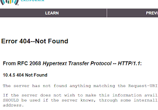
I tried about 12 times using the chrome browser to get the login page to load and each time I was greeted with this message:
Clicking on the link did nothing.
After 12 attempts I switched over to Internet Explorer 10 and was finally able to sign up and login.
The sign up process was relatively simple with the exception of the fact that it asked me for my SSN without ensuring me that it would stay safe in their hands. I was able to skip this field during the signup process so that was good.
The username has to be 8 characters long which is in my opinion a point of friction and will cause the form to produce and error for 1/2 the people who try to sign up. Why not do a quick edit check with Javascript and let the person know right away before they have to submit the form and see the error?
Anyway, I then tried to login and got a 404 not found page. I refreshed 2 times and got the login screen which asked me for 5 answers to secret question. As soon as I selected those, it crashed and made me login again. That I will forgive because it is a new site and they're still working out the bugs. But the secret question thing .... it should be optional IMO.
Then I tried to actually Apply for a plan. That's when things got really ugly. I cannot proceed in this form without providing them with my SSN and Naturalization documentation. WHAT?!! Why do you need these just to show me what plans I qualify for and how much they will be? Why at this stage? And again, I don't feel safe entering my SSN in your 404-Not-Found website just yet, so unless you're gonna make me feel safe with my information with a robust website, then don't ask me this stuff until I'm ready to commit. I can't even navigate directly to www.calheers.ca.gov ... What is v.calheers.ca.gov? You have to know that this is confusing your users. You have to know that I may not be interested in the plans once I see them, so having given you a bunch of information during the shopping stage is just going to drive users away. I would love to see the bounce rates of this page. Let me guess, 100%.
And really, what is with all the different branding? Are you trying to make me suspicious of you? There is healthcare.gov, that takes me to coveredca.com, that takes me to v.calheers.ca.gov which has the title AHBX portal. How is that user friendly?
But don't worry, CoveredCA. I'm not all negative feedback. I actually have some very simple solutions to make this easier for you:
1) Pick a web domain and stick with it. CoveredCa.com makes sense since people have been hearing it.
2) Allow the user to enter non-personal information and arrive at a quote with details. Then if and only if he chooses to select the plan, make him verify all you want.
3) At least try to have the styling of your site match Healthcare.gov in some meaningful way. Users like continuity, it builds trust.
4) If you want me to enter my SSN and DOB and other identity information ensure me that it's going to be safe somehow.
5) This initiative already has enough barriers, if I am having trouble using the system, you can be sure that my mother is definitely going to have issues. Things like browser compatibility, Http routing errors, general performance, and post submit error checking are only going to add friction to the process. As it stands right now, I cannot imagine you'll have many people complete the application process, much less sign up for coverage. Glad to help.


